Tuesday, May 24, 2016

Colorful backgrounds

Hello crafty friends

I'm back today with a really colorful project I started on this past weekend at one of my favorite spots, Memories and More.


As in my previous posts I have been on an Alcohol Ink train for the past couple of weeks.  I had some of them in my craft stock but never really knew how to really make them look lovely.  The colours I had previously purchased were fairly dull so it didn't inspire too much as I tend to be drawn to more colorful projects. I purchased some new colours and then had a quick tutorial from a dear friend and off I went and I'm having so much fun!

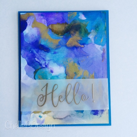
I changed things up a bit when I created the background for this card (thank you Maresa for the tip).  I used the "swipe" method to get this amazing background.  I followed the basic instruction of dropping the ink but I did it onto my craft mat this time, instead of directly onto the paper.  I took my cut out piece of Specialty stamping paper and dropped it onto the ink, face first, and then swirled it slightly and then swiped it across the ink.  After lifting I titled the paper a bit to get those really neat "running" effects you see near the bottom right of the photo.  The possibilities are really endless when it comes to how you can get the ink onto your paper.  I'm looking forward to trying some new ways over the next couple of weeks so stay tuned!

For the second layer of the card I took my Altenew Wild Hibiscus stamp set and stamped one of the flowers randomly around my paper using Versamark ink.  I added some Lindy's stamp gang embossing powder to my stamped images and heated it with my heat gun to set.  Once the paper had cooled I dropped some of my alcohol inks onto an acrylic block. I also dropped a dab of plain alcohol onto the same block. I then took my aqua brush and dabbed it into the alcohol and then into my chosen ink color. Once my aqua brush was filled with colour I proceeded to paint in my flowers directly onto the paper. I varied between two of the colours to fill in the flowers.

The floating flowers you see on the third layer is vellum, embossed with the same stamped images in the second layer using the technique in step 2.  Then I took my aqua brush I coloured in the flowers as in step 2 but onto the vellum this time. The embossed edge of the flower helps to contain the alcohol/ink.  Once dried, which is really quickly, I fussy cut out the flowers and then applied them over top of the existing flowers with glue dots.  I curled up the edges of the vellum a bit so that you could see more of the three dimensional effect.

My second to last step was to add the sentiment to my card. Using the sentiment from the Altenew stamp set Wild Hibiscus I stamped it onto my card using Altenew crisp ink in Dusk.  I then quickly applied my Lindy's stamp gang powder over top and applied heat to set.

I added a little touch of sequins to my card. Pretty pink posh (rose gold 4mm) to the center of the flowers and then the additional sequins are from Memories and More.

I'm hoping to film a YouTube video in the near future on my alcohol ink backgrounds but for now you can visit the awesome Tim Holtz on YouTube and he has some really great videos on using alcohol inks. You can find him here.

Thanks for dropping by and stay tuned for more alcohol ink adventures.


Tuesday, May 17, 2016

Neutral glow

I tend to be drawn towards bright and vibrant but for today's card I decided to keep it neutral. 

Continuing on with my venture into alcohol ink backgrounds I wanted to make a card that was suitable for many occasions. The subtle colors and simple Hello make it easily adaptable. My first thought of whom I could give this to would be a friend who maybe wasn't feeling well and needed a hug. When you're far away a simple card with a hello or thinking of you can help make your day a bit brighter. I love getting snail mail and in fact I just received a beautiful card from a friend on Friday. She's the one who got me started on my alcohol ink journey and who has taught me so much! Thank you Maresa!

The instructions for the background can be found here: 

http://chellebdesign.blogspot.ca/2016/05/did-someone-say-alcohol.html

I used the mini Hero Arts stamp set called "Spring Hello" for my embossed sentiment and Ranger silver embossing powder. I also embossed a piece of white cardstock, around the edge, with the silver embossing powder to use as my layering piece behind the front layer. Easy way to get an embossed piece of paper to match your front layer.

Hope you've had a great Tuesday!


Monday, May 16, 2016

Altenew Magic

I'll be the first to admit that I am just a little bit addicted to Altenew stamps. As I mentioned in yesterday's post they are very versatile and offer a lot to your imagination. When stamped in the layered option they are gorgeous but I am always trying to think outside the box and in today's card I did. 

Instead of using all the layers I decided to just use one of them and the effect is gorgeous. I used a silver pearl translucent embossing powder to emboss with. I love using this one because it doesn't distract from the background but in certain light and angles it really pops. This is the "Beautiful Day" stamp set. I embossed the sentiment in a gold powder.

For the background I used the same technique as yesterday's post which can be found here:

http://chellebdesign.blogspot.ca/2016/05/did-someone-say-alcohol.html

Hope you've had a awesome Monday and stay tuned for another alcohol ink card I made this past weekend. 

Michelle 


Sunday, May 15, 2016

Did someone say Alcohol??

I hope that title grabbed you because I do like to add a little excitement to my posts and while I'm not referring to the drinking kind of alcohol I am using a different type on today's card.

I am constantly absorbing new, or new to me, ideas on how to create WOW cards and for today's post this is definitely a fun new way to look at backgrounds for your cards.  In reality it's like I am creating my own paper which is so much fun!  If you know me you know I like to have fun, especially if it's when I am creating cards. The full instructions on how to create this gorgeous alcohol ink background can be found at the bottom.  Enjoy and please feel free to drop me a comment at the bottom.


The stamps you see on the forefront of the card are by Altenew and it's their Beautiful day set.  I love this set because it offers so many possibilities for stamping.  The stamps are a layered type of stamp but as you can see I only used the final layer of the stamps which is the outline.

Other supplies used:
Copper embossing powder (I prefer Rangers powders but you can use any powder you like)
Versamark embossing ink pad
Bazzil cardstock
Brads (Any colour will do as you can just emboss them with the copper embossing powder to adapt them to your colour scheme)
May Arts ribbon
Foam mounting tape


Alcohol background technique
The supply list for the background is quite small:
Alcohol (like the rubbing kind - first aid) 90% or above.
Ranger Adirondack Alcohol Inks
or
Ranger Archival Ink Re-inkers
Palette Knife
Ranger Specialty stamping paper

1. Cut your paper to the desired size
2. Generously drop the alcohol onto your paper.  No need to cover the whole paper completely just large drops here and there.  It works easier if you put the alcohol into a smaller bottle before dropping onto the page or you can also use a eye dropper type of device.
3. Drop 1 to 2 drops of the chosen colours (I use 3 colours and then a metal ink like copper) of either Archival or alcohol inks onto the paper.
4. Using your palette knife (kind of like spreading butter) spread your ink/alcohol throughout the paper.  Do not spread it too much as you want the colours to be blended but not so much that you end up with one colour.  It's also okay to leave white areas as this adds interest.
5. Put it aside to dry and that's it.  It really is that easy.

Once it is dried, which depends on how much ink you've added, you can then embellish as desired.


Friday, May 13, 2016

Wading in watercolor

Creativity is contagious, pass it on - Albert Einstein

Such a great quote and one of the many reasons why I love to share my creations.  I've learned so much from many people and feel that passing it on is another way I can pay it forward.

Today's post is all about watercoloring with the non-traditional methods.  I discovered watercoloring with Distress markers quite a while ago and have been having fun with this technique ever since.


To begin I started out with a piece of Strathmore Bristol paper cut down to 4 1/2 x 6.  I stamped the Altenew Peony Scrolls flowers and leaves with Versamark onto my paper.  I then added Rangers Queens Gold embossing powder and applied heat with my heat tool to melt the powder.  On a separate piece of paper I stamped a peony and some leaves so I could fussy cut those out for later.


I scribbled variation of pinks and purple Distress markers onto a clear acrylic block.  Using my waterbrush, which was wet, I picked up colour from the block and began coloring in the images. The more water on your brush or on the paper the more variegated effect you will have with the colours. Once the flowers and leaves were dry I added in my background colour behind the flowers.  Again I placed the colour on my acrylic block and then picked it up and applied it to the paper.

Once the background layer was dry I cut a piece of vellum and stamped on the "Thank you" sentiment with Versamark, added the Queens gold embossing powder and heated it to melt the powder.  I wrapped it around my watercolor paper and taped it at the back to secure.  I then applied the extra flower and leaves over top of the vellum for added dimension.

Lastly I mounted the watercolored paper to a piece of recollections purple cardstock using 3d foam tape and then mounted it onto a blank card. 

Thank you for popping by and if you have any questions about the products used or techniques please feel free to drop me a comment below. 

Most of the products used were purchased from my local store Memories and More in West Kelowna, BC. ( www.memorycrafts.ca )as well as from another local B.C. store called All Ways Scrapbooking ( www.allwaysscrapbooking.com ) from Salmon Arm.  I like to support local when possible. 


Thursday, May 12, 2016

Playing with inks

Hello!

I'm back today with some fun cards I made last weekend. I learned a fun "new to me" technique from my super duper crafty friend Maresa.  After being in the industry for a number of years she is a wealth of crafty ideas and techniques and this one technique had my eyes glued to the paper. It's the alcohol/archival ink reinker technique and it creates these amazing backgrounds for cards.

All you do is take a piece of Specialty Stamping paper, drop on some alcohol (the medical kind and the higher the content the better), add a few drops of archival ink reinker (3 colors seems to work great) and then very slightly blend with a palette knife. Spreading the ink through the alcohol like you would do if you were spreading peanut butter on bread but with a lighter touch. Voila .. That really is it!!! It dries in no time at all.


On my second card we stamped an image with Versamark, embossed the stamped image (Altenew poppy stamps) with ranger "queens gold" embossing powder. With a damp watercolor brush we picked up colour from an acrylic block (one drop of each color onto the block) and coloured in the stamped image (poppies in this case). Once it was dry we added masking fluid over the coloured in image. Let that dry and then proceed with the same steps as the first card. Once dry, peel or remove the masking fluid with an eraser. I love love love this technique and will be sharing more projects with it in the near future. 


Thanks so much for stopping by!! Feel free to ask questions about my supplies used or if you are unsure about the technique!

Michelle 😉


Sunday, May 1, 2016

Day 4 - Online Card Clases "Clear & Sheer"

Happy Sunday everyone,

Welcome back to my Day 4 take on Online Card Classes "Clear & Sheer".  Day 4 brought us many creative ideas on working with vellum and acetate.  Acetate brings such a subtle effect to any project even if it's the main focus or if it's just a small accent on your card. Vellum is much the same .. it's a surface that can be altered in many ways and can create pretty ethereal results.  I'm learning to work with both as they are quite new to me.

So for today's project I decided to make a really basic card that let the focus be on the die cut.  Sometimes simpler is better and in this case I think it works quite well.

The key for working with acetate is that if you glue something to the front of the acetate you have to follow up with gluing something to the back to cover up the glue.  You work with layers so cutting out multiples of the same thing is key in this case.  Also in order to have an area to write on, inside the card, you have to follow this same rule of thumb where you have to double up on your layers.  


Hope you've had a wonderful weekend and I'm looking forward to our wrap up session later this week.  I hear shaker cards are in our future ;-)

Supplies used:
Opus art supplies - heavy weight synthetic acetate
Sizzix (Tim Holtz alterations) - Globe die
MFT Stamps - Label maker sentiments clear stamps
MTS Die-namics - Label tape dies
Strathmore - Bristol paper (white)
Bazzil - Black cardstock
Ranger - Archival Ink in Jet Black and Multi Medium Matte adhesive
Scrapbook Adhesives - 3D foam squares